David hasn’t created a dedicated typeface, but he has developed a couple type styles that he incorporates into his work. Since David is constantly trying new things, it’s hard to to put a name to all the lettering he does.
“I love to work with gradients, shapes and paints. Of course using typography. I like to give some effect to the letters, whatever it is but something that its out of the ordinary”
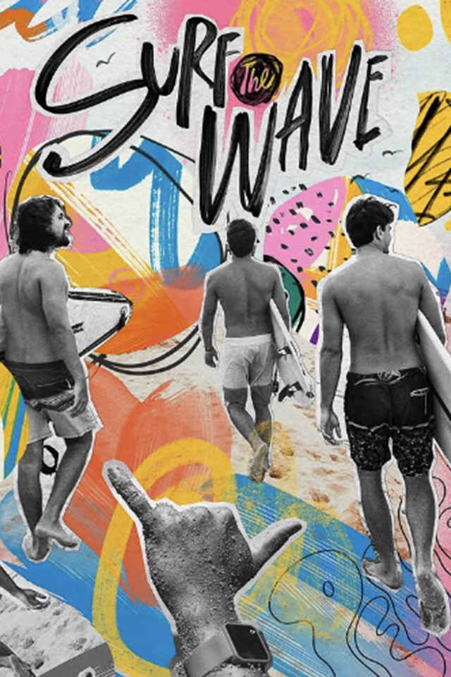
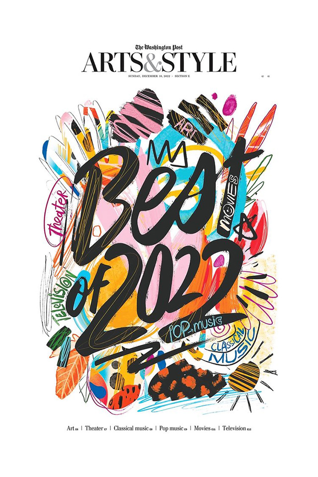
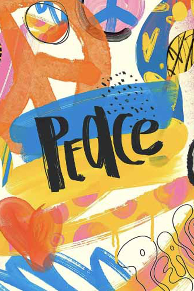
A common style of type he uses across his work is his traditional style brush lettering. These are done with actual paint brushes and pens or with digital brushes that imitate real brush strokes, and . Each letter has a variety of weight due to the pressure that David applies to each stroke, but it's usually very thick. There is also a distinct angle as a result of the direction he writes them in. All of these aspects make for a bold style that’s great to contrast the various colors he uses.
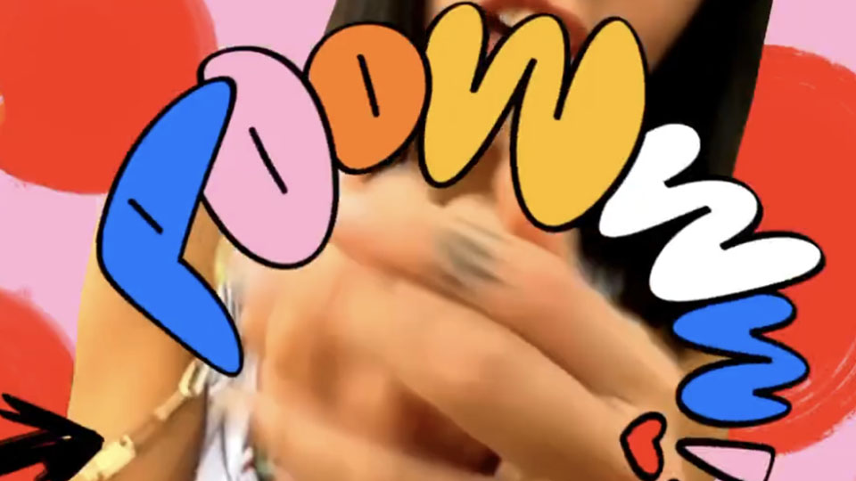
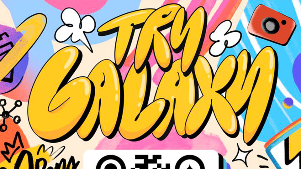
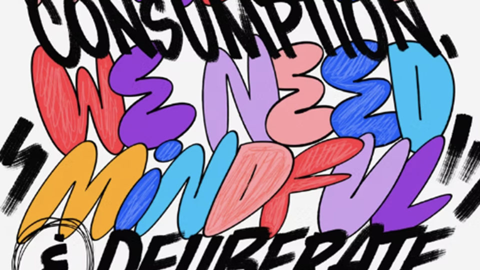
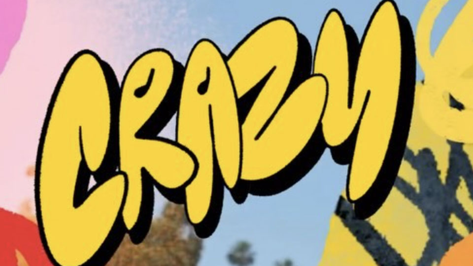
David also has his own unique style of bubble lettering. These letters, like most of his lettering, are hand drawn, and use a minimal amount of color to differentiate them from the rest of the colors in his compositions. The corners of letters are thinner than regular bubble letters, giving a pinched effect. An interesting stylistic choice he makes is making all the letters visually the same height. He brings up the lowercase letters to the cap's height, with the surrounding letters changing to visually support them. This makes this type of lettering resemble all-caps typefaces, which are great for popping out to the viewer.